CREATING HIGH QUALITY TILEABLE TEXTURES
Short Overview
In this tutorial we will take a photo and turn it into a 1024x1024, perfectly tileable multipurpose-texture. : )
Intro
First we need to ask ourselves the most important question:
How will the texture be used?: This determines how big the result will have to be. Although you should always work as big as you can. - The size can always be reduced later on...
Then you have to aquire the raw material for your texture. In most cases this will be photos or scans. And in most cases you will have to take these photos yourself...
Some Advice on taking photos for textures:
 - Think about the scale of the objects in your texture, so you know how close to zoom in or how far to to go away from your motive.
- Make sure there are no (or few) shadows. (If possible place lights to achieve a steady light-situation. - This will save you a lot of time, because you won't have to color-correct certain areas.)
- Try to take the photo with the camera-vector normal to the surface. (This is a must if you want your texture to look good from all directions!)
- Take as many photos as possible (and reasonable). The more material you've got to select from, the better.
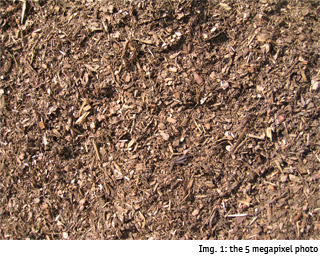
In this Tutorial I'll use a 5 megapixel-photo of hogged wood, taken from a distance of about 1m.
Let's go
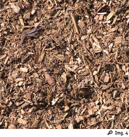
We start with an empty 1024x1024 image and insert the photo we want to use in its full size as an own layer. (let's name it "orig. image") Place your layer in such way that there are as little flashy objects as possible within the red area I marked in Img. 3. (Because this is where our image will be tiled.)
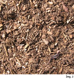
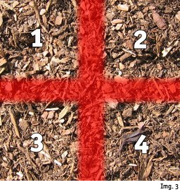
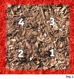
Now pull a mask around the whole image and use to create a layer just from the visible area and name it something like "ground". Use with these Values: (The image gets pushed 512px to the right and 512px to the bottom, whereas what is being pushed out of the canvas is being pushed back in on the opposite side - Just take a look at Img. 3 and Img. 5) So now the former borders of the image are in the center. The red area from Img. 3 is now at the borders. (Note: If you don't use Photoshop you can manually split the Layer into 4 parts and rearrange them. The numbers illustrate how to rearrange the pieces...)
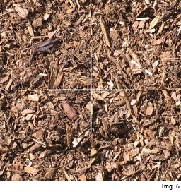
In Img. 6 I have marked where the four parts of the image meet (that's what I call the "cuts"), making them easier to see. Our image would now tile easily at the borders, but the result would still be an image with visible cuts. The advantage that we gained by using the is that now the point where the images tile is in the center of our image and can therefor easily be edited out.
So let's cover the cuts in the center of our image
The Idea is to just put details from the same photo on top of the cuts we just created. (It might be helpful to draw a white cross on the "ground"-layer yourself, so there's no way you could forget to cover parts of the cuts.)
In the Layers-tab select "orig. image", right-click and select . Name the new layer something like "cover" and drag it to the top. (Of course you could also use other images, but make sure they don't look completely different, or change them until they fit)
Again move it around until there are as little flashy objects as possible over the cuts (the old red area in Img. 3?).
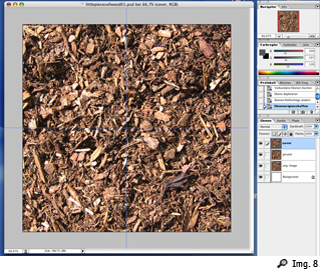
To make it easier to remember where the cuts were, turn the "cover"-layer invisible, drag to the cuts and make "cover" visible again. Your workspace should now look like this: Img. 8.
Now take the (alternatively you could also use the ) and set the to something between and and the to . (Yes, I know that's tiny for a 1024x1024-file, but only if you work very detailed the result will look good.)
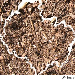
and make your way from one side to the next, erasing along objects until the layer looks like Img. 9 (if you put it against white background - But don't erase against white background, work with "ground" being visible, so you instantly see how the two layers play together.)
It doesn't have to be perfect, but it has to be good enough to not be noticeable.
Now you can set and to something higher, switch everything but the "cover" layer to invisible and quickly the rest of the unwanted area. The borders have to stay free, because that's where the image already tiles perfectly, remember?
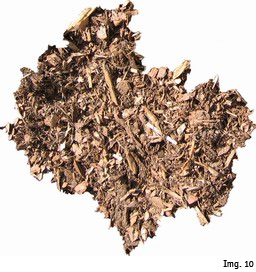
Against white background my "cover" layer now looks like this: Img. 10.
Notice: In the four places where the cuts meet the border of the canvas, I go as close to the border as possible...
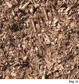
"Ground" and "cover" together look like this: Img. 11.
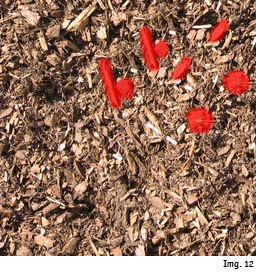
Try to avoid using the same details more than once, or it will look bad when you tile the texture. You can see that in the top right of our image this is the case. I've marked the most flashy details in Img. 12. (The more source material you have the easier it is to avoid this. A way to avoid this problem would have been to place the "cover" layer so that it would have exactly matched the top right quater of our "ground" layer. That would also have saved us one quater of the Eraser-work. But now that the damage is done, we've got to cope with it...)
So let's solve our problem by erasing some of the flashiest details from "cover" and putting in other details on top of "ground". I delete the big piece of wood from "cover" (since it's not over the cut, it doesn't matter anyway) and I put a little detail from the original photo on top of two of the other problems. "Cover" now looks like this: Img. 13, and the whole image looks like this: Img. 14.
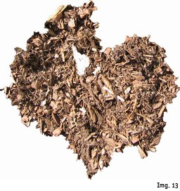
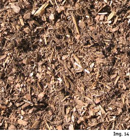
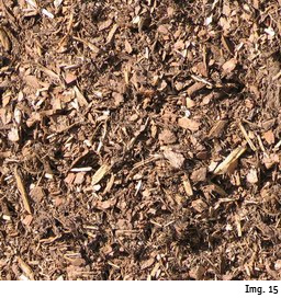
Now let's do an , so we have our texture on a single layer. Use to push it by 512/512 once more. If we worked well around the endings of the cuts, there will almost no cut be visible in the very center. If there is a cut visible (most of the time it's just a little cross), just put another detail on top of it. With that done, Img. 15 is what our image looks like.
Better tiling
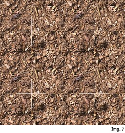
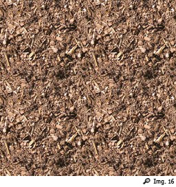
Now we will try and tile the texture... (It can be handy to record a Photoshop-Action that does this automatically.) Look at Img. 16 – You see our texture tiled four times. (I reduced the image-size to 50% here) There are no borders visible, but you notice that some details stand out and build a pattern. (this gets worse the more you decrease size and the more often you tile) Even if we tried to avoid flashy objects all along there will still be room for improvement at this point. (Although with experience you do get an eye for elements that could cause problems) I have marked the most obvious problem of our texture in Img. 17.
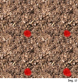
So let's iron it out... Just find a non-flashy detail and put it on top of the problem. With that done, let's tile again and look at the difference:
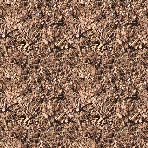
Normally with the bigger problems gone, lesser problems spring forward. So just test and correct over and over and over again until it looks good. This is actually the hardest part, because it takes a lot of work to achieve a really even result...
Do rotate your texture from time to time, to see if it looks good from all directions. This is especially important if you plan on using your texture in virtual environments where the user can move around freely (like in computergames).
If you don't work on the borders all your corrected versions of the texture will be tileable with each other. In some computergames you can import a texture set and the textures will be alternated in a random way.
If you need to work on the borders use the again.
Thanks for reading this tutorial. Please feel free to send comments and suggestions as well as your own results to markus[at]kapturak.com
This one and many other textures can be freely downloaded from our texture archive at xxx (powered by ONCE ENTERTAINMENT)
